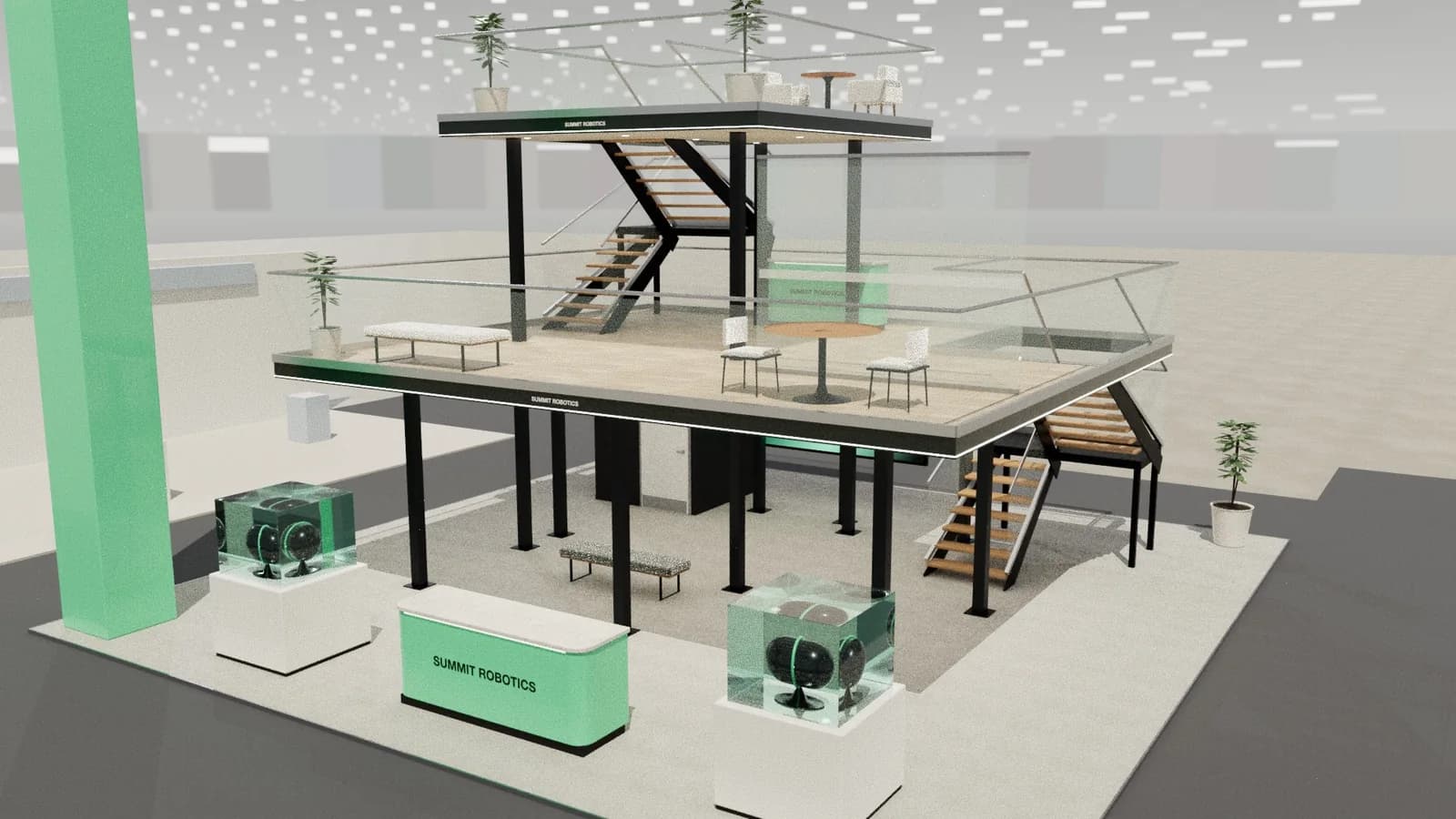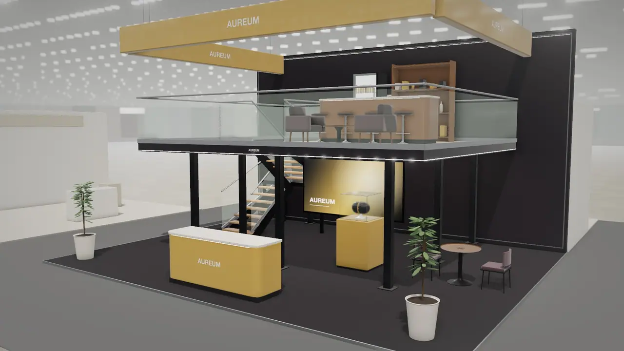
In short
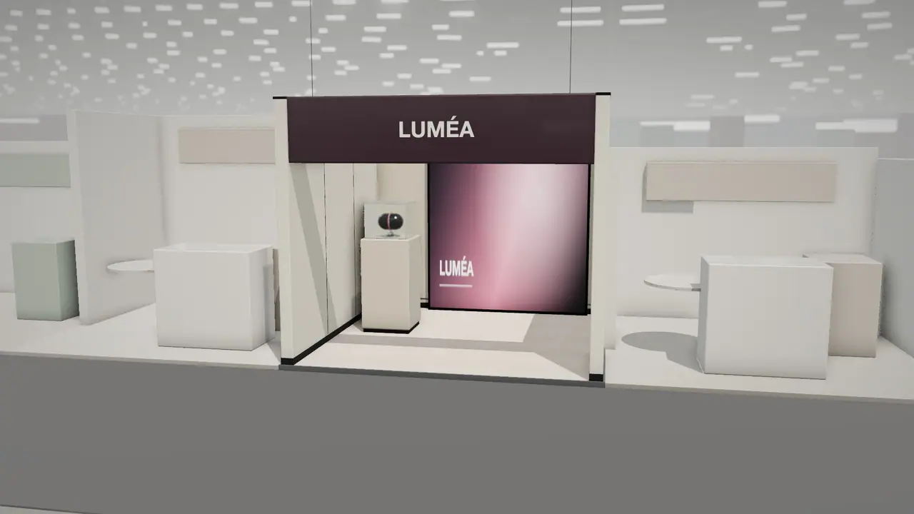
A premium stand gets its effect from restraint and control more than from money. It leaves floor empty, limits itself to a few real materials, uses light with care, and keeps every joint and edge clean. It shows one object in the way a gallery would. Cheap-looking stands usually have the opposite problems: too many messages, flat lighting and details that were not thought about until the stand was on site.
Key points
- Empty floor is the clearest sign of confidence.
- Three materials are enough.
- Control the light, and most of the job is done.
- Details decide the impression at close range.
Six rules of premium stands
- 1Show less. One product on one plinth reads as more valuable than a shelf of twelve.
- 2Leave the floor empty. Empty floor in an expensive hall shows that you can afford not to fill it.
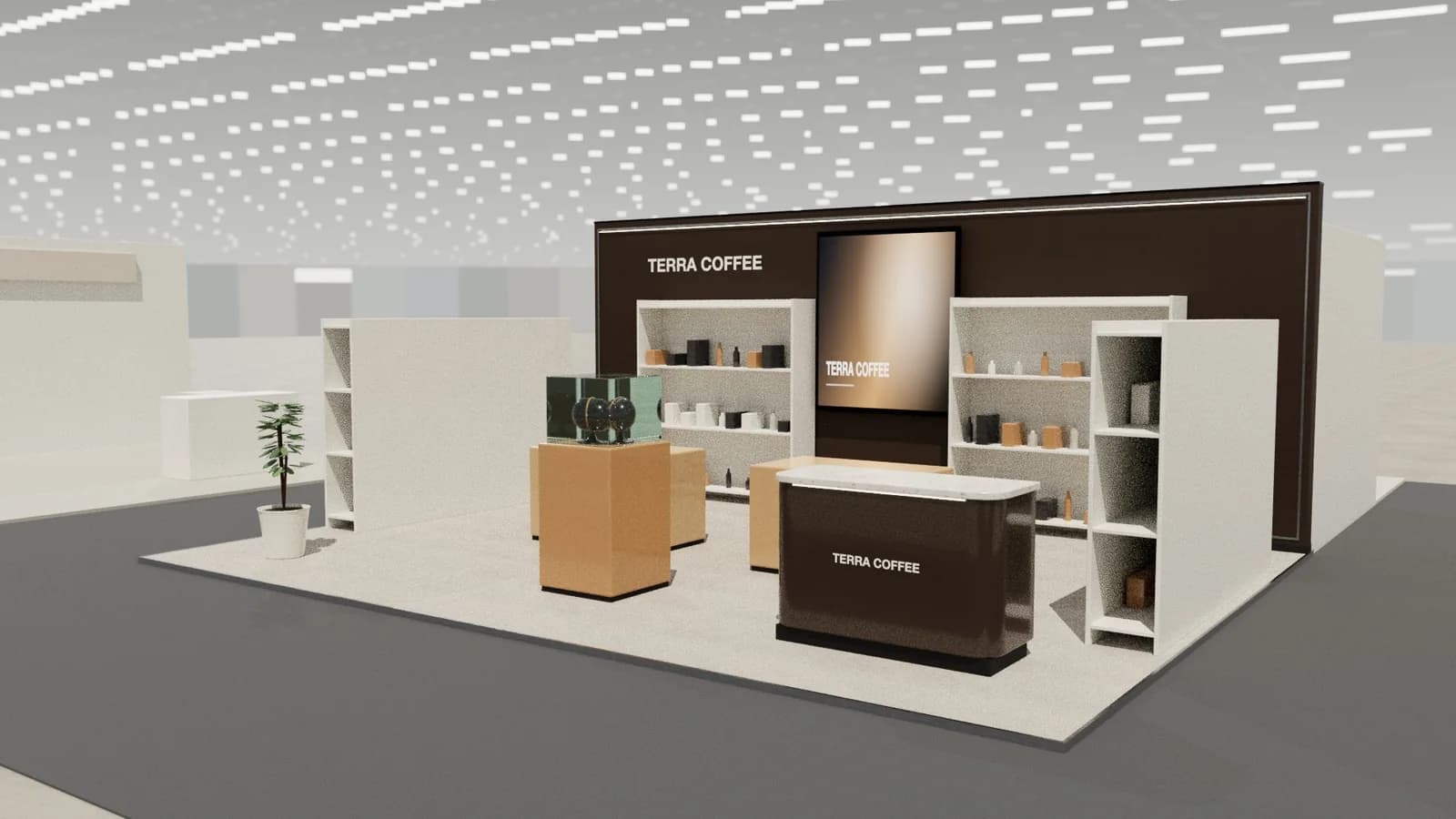
- 3Use real textures where hands go. Timber, stone, metal and leather at the counter. Print can stay on the far wall.
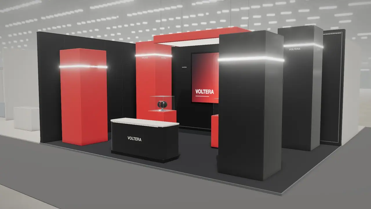
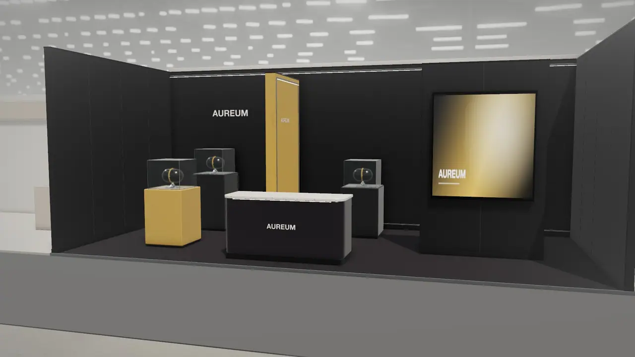
- 4Dim the room, light the object. Premium lighting has contrast. Evenly bright stands look like shops.
- 5Keep the words short. A logo and one line. Specifications belong in a conversation.
- 6Hide the mechanics. No visible cables, no brochures on the floor, no boxes in sight.
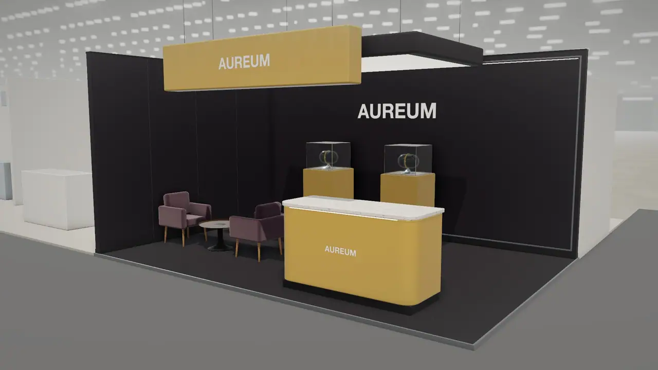
Palettes that read as premium
| Mood | Materials | Suits |
|---|---|---|
| Ivory gallery | Off-white walls, pale stone, brass | Beauty, jewellery, architecture |
| Warm noir | Dark walnut, smoked glass, warm light | Spirits, watches, automotive |
| Quiet timber | Oak battens, linen, soft white | Design, wellness, food |
| Technical calm | Light grey, satin metal, thin lines of light | Medical, engineering, finance |
Premium is also how people are treated
A beautiful stand can be ruined by a queue, a warm glass of water or staff staring at phones. Decide what happens in the first thirty seconds: who greets a visitor, where they can sit and what they are offered. Then design the space to make that easy, with a hidden coffee point and storage within reach. See meeting rooms and hospitality.
Where to spend
- The entrance and the first three metres, which are seen most.
- The counter, which people touch.
- Lighting design, including someone who adjusts it on site.
- Good cleaning and touch-up during the show.
Save on the walls nobody touches, on storage, and on flooring away from the entrance. If the budget is small, read how to make a small stand look premium.
Frequently asked questions
01What makes an exhibition stand look expensive?
Fewer materials, controlled lighting, empty floor, clean details and very little text.
02How much does a luxury stand cost?
There is no fixed rate. Premium finishes, custom joinery and lighting design push it above standard custom builds, so price it from a drawn design.
03Should a premium stand be closed or open?
Often a mix: an open front with a controlled entrance and a private room behind. Some luxury stands are appointment-only, with a small visible showcase.
04Is a dark stand more premium than a light one?
Not by itself. Both can be. See [dark vs light stands](/guides/dark-vs-light-exhibition-stands) for when each works.
Put it into practice
An AI booth designer that designs in 3D, not in pixels
An AI booth designer that plans an exhibition stand in 3D at your size, checks it can be built, and changes it when you ask in plain English.
Guidance here reflects common practice. Venues, organisers and countries set their own rules: always check the exhibitor manual and work with a qualified stand builder and engineer for structures.