In short
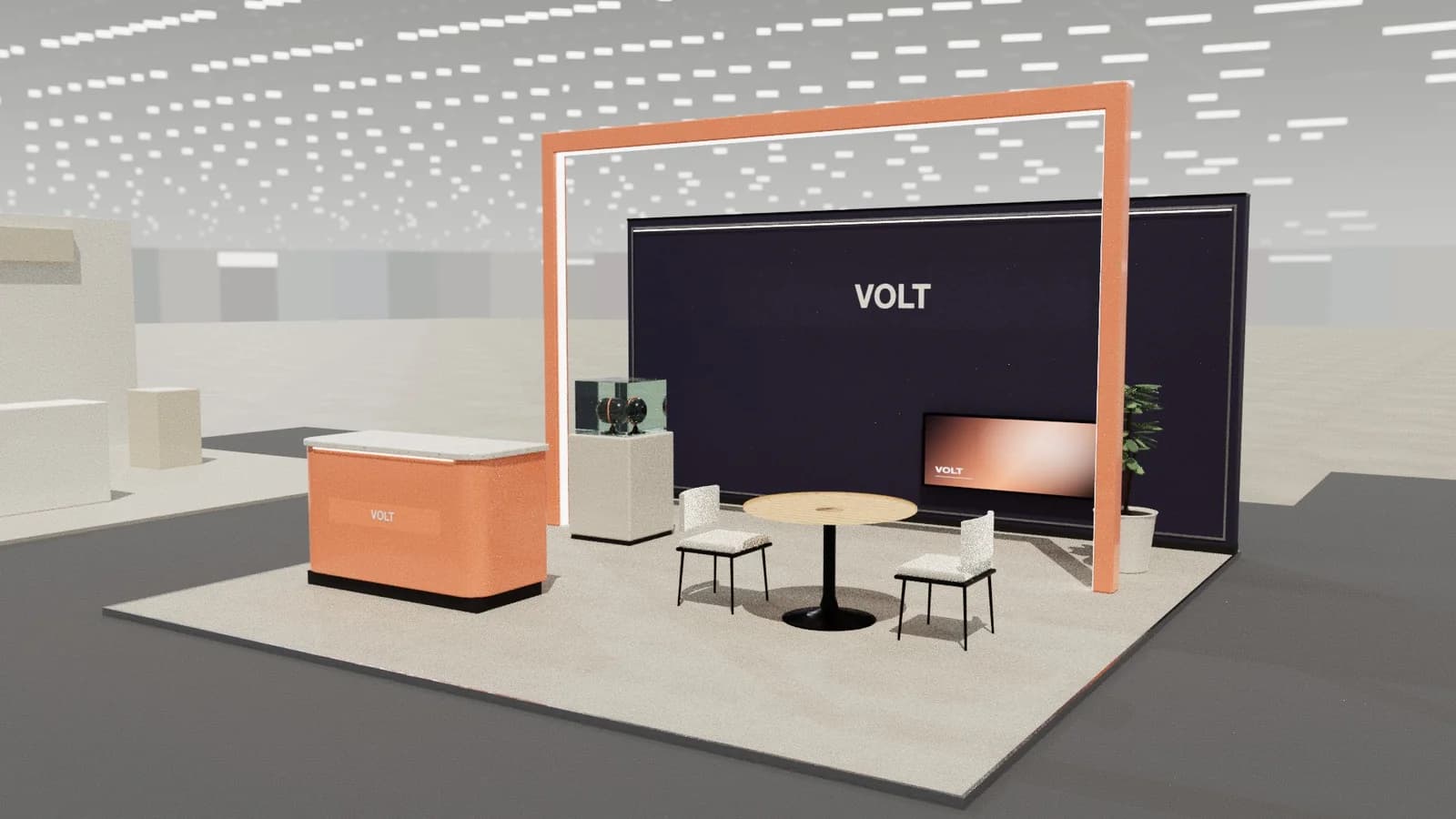
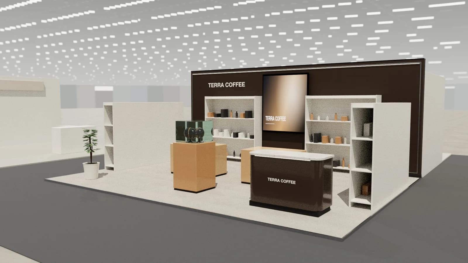
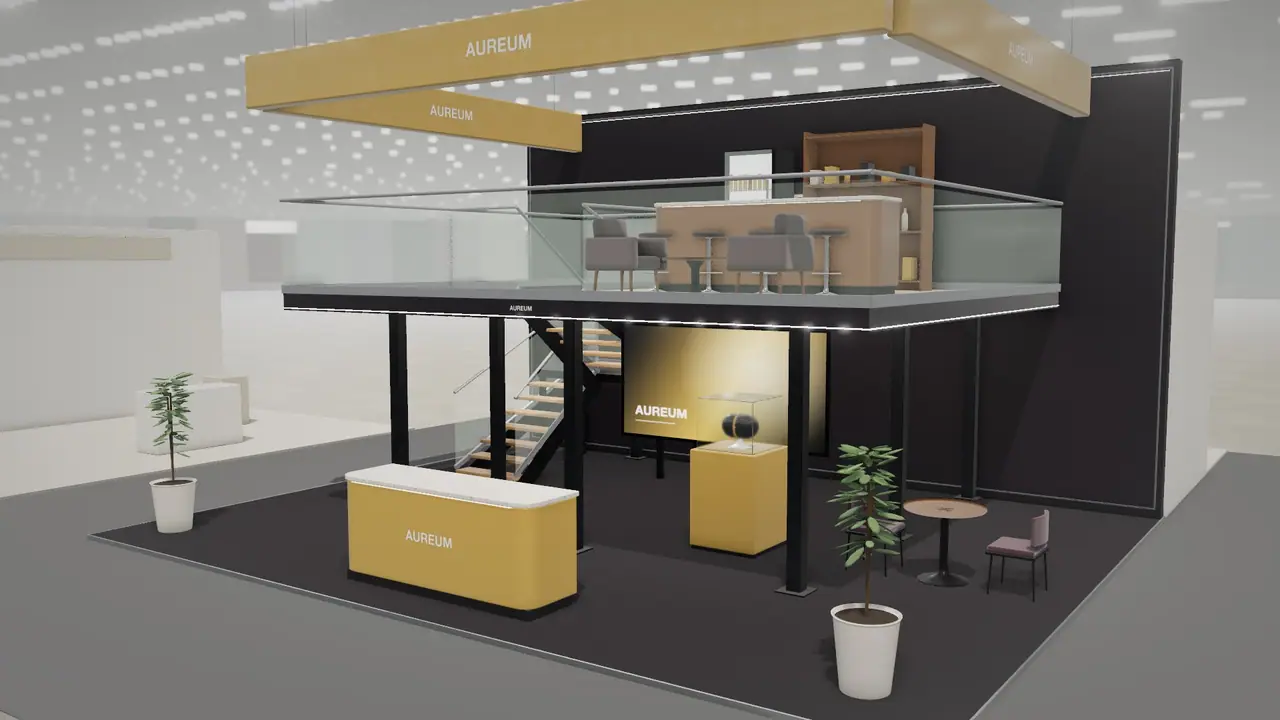
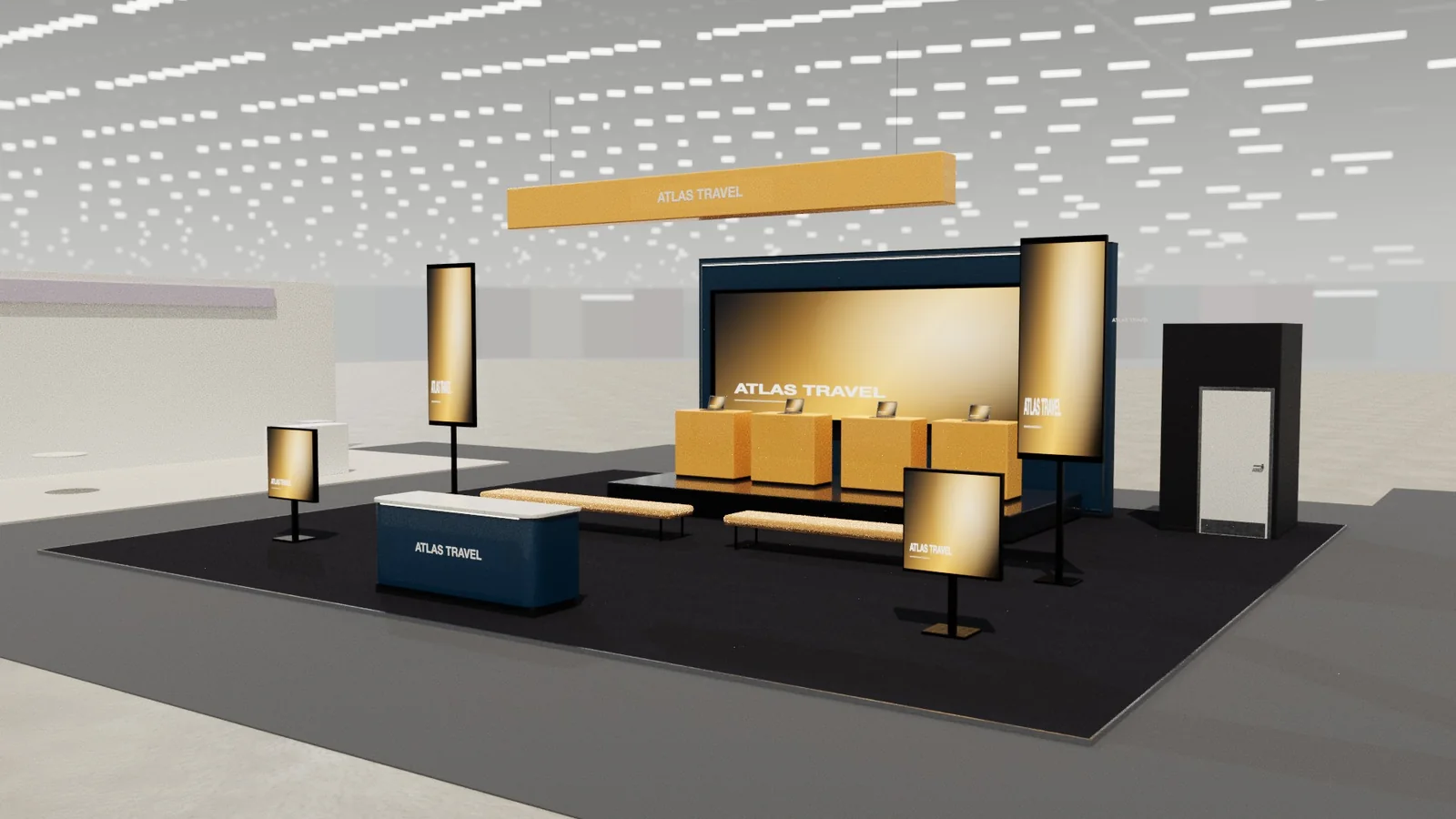
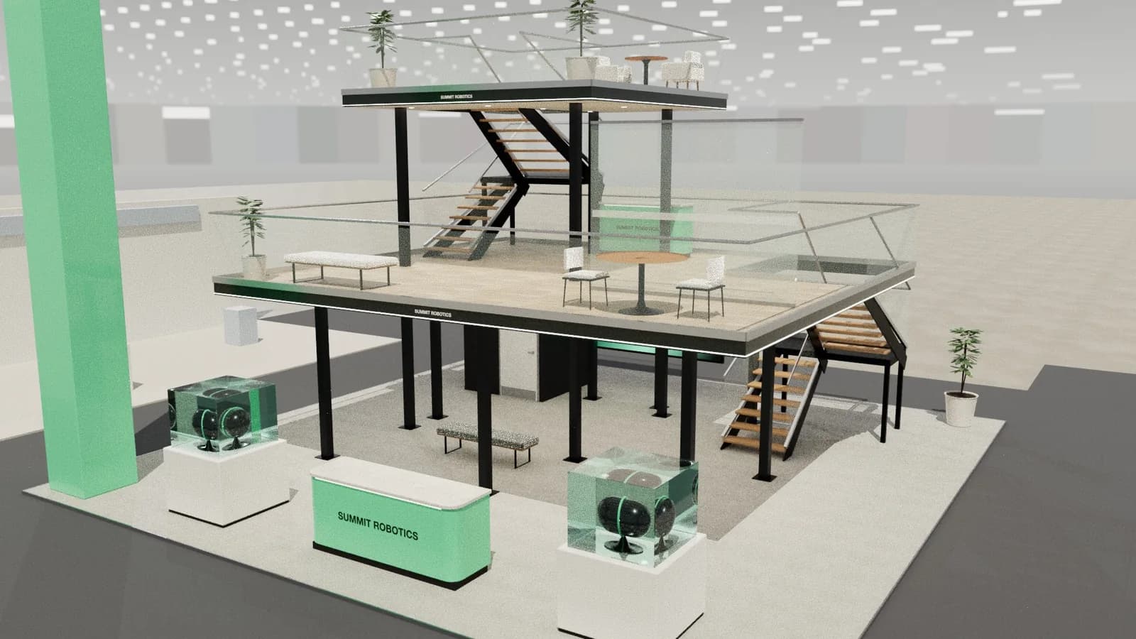
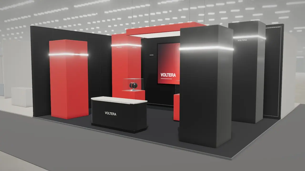
Light stands feel open, show details and photograph easily, which suits medical, technology and most small stands. Dark stands make screens and lit products stand out, and feel intimate and dramatic, which suits automotive, gaming and luxury brands. Dark needs more lighting skill and shows dust; light shows scuffs. Choose by what you are showing, your neighbours and how bright the hall is.
Key points
- Dark helps screens and lit products.
- Light feels bigger and more welcoming.
- Dark stands need more careful lighting.
- Check the look of the halls before you decide.
How they compare
| Light stand | Dark stand | |
|---|---|---|
| Feel | Open, clean, calm | Intimate, dramatic, focused |
| Screens | Compete with surrounding brightness | Pop out of the wall |
| Products | Clear, well suited to detail | Lit objects stand out |
| Space | Feels larger | Feels smaller, but can feel richer |
| Photographs | Easy | Needs care with light levels |
| Marks | Scuffs and shoe marks | Dust and fingerprints |
How to decide
- 1Start with the hero: a screen or a lit product favours dark, and a white device favours light.
- 2Check your brand: a colour that dominates the logo may work against a dark wall.
- 3Look at the hall: dark stands are harder in a bright hall with daylight.
- 4Consider the plot: dark can feel oppressive on a closed row stand.
- 5Think about visitors: older audiences and accessibility needs favour stronger contrast and brighter routes.
Mixing the two
Many good stands use a dark ceiling or floor with light walls near the entrance, or light outside with a dark room within. A dark core with a bright front draws people in, as the eye moves to the lit area first. Use the colour guide to choose the palette, and the lighting guide to set contrast.
Practical issues
- Dark stands need a darker floor too, or the floor will shine.
- Black absorbs light, so you need more fittings, and more power.
- Keep routes visible. Very dark floors with steps or edges need marking.
- A dark stand needs a cleaner on site; fingerprints show badly.
What usually works by sector
| Sector | Usual choice | Why |
|---|---|---|
| Medical and pharma | Light | Clean, trustworthy, easy to read |
| Gaming | Dark | Screens and LEDs dominate |
| Automotive | Dark or mixed | Lit vehicles stand out |
| Food and beverage | Light or warm | Food looks better in warm light |
| Luxury | Either | Depends on the brand's own world |
Frequently asked questions
01Is a white exhibition stand a good idea?
Yes, for clean, open brands. It shows every mark though, so plan cleaning and protect low edges.
02Do dark stands attract more attention?
They can, in halls full of white stands, but mainly because of the contrast. A dark stand in a dark hall won't stand out.
03What colour floor goes with a dark stand?
Usually dark carpet, or a satin finish to avoid mirror-like reflections of lights.
04Do dark colours make a stand feel smaller?
Often yes, particularly on closed row stands. Use dark on one surface or feature first.
Put it into practice
An AI booth designer that designs in 3D, not in pixels
An AI booth designer that plans an exhibition stand in 3D at your size, checks it can be built, and changes it when you ask in plain English.
Guidance here reflects common practice. Venues, organisers and countries set their own rules: always check the exhibitor manual and work with a qualified stand builder and engineer for structures.