In short
A low-budget stand looks good when the money goes on the few things visitors notice (a large, simple back-wall graphic, good lighting and one strong focal point) and is saved on everything else: hire furniture, reusable fabric frames, no bespoke joinery, and no more space than the plan needs. Clutter, weak lighting and wordy graphics make stands look cheap, not their price.
Key points
- Spend on the back wall graphic, lighting and one focal point.
- Save with hire furniture, reusable fabric frames and standard sizes.
- Take a smaller, better-located space rather than a large, empty one.
- Fewer, larger messages look more expensive than many small ones.
- Reuse: design the kit to work at several shows and sizes.
Where to spend and where to save
| Spend on | Why | Save on | How |
|---|---|---|---|
| Back wall graphic | Seen from the aisle; carries the brand | Furniture | Hire it, or reuse one branded counter |
| Lighting | Cheap stands look dull; light lifts everything | Flooring | Organiser carpet or one coloured rug |
| One focal point | A product, screen or demo gives a reason to stop | Bespoke joinery | Use standard frames and fabric |
| Staff training | People make the stand work | Printed literature | QR codes and follow-up emails |
Ideas that look more expensive than they are
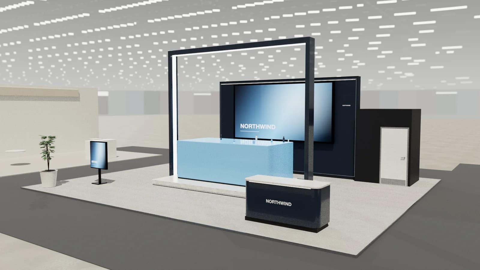
- A single full-width tension-fabric graphic with one bold image and the logo high up.
- Backlit fabric (a lightbox) instead of more spotlights: one glowing wall reads across a hall.
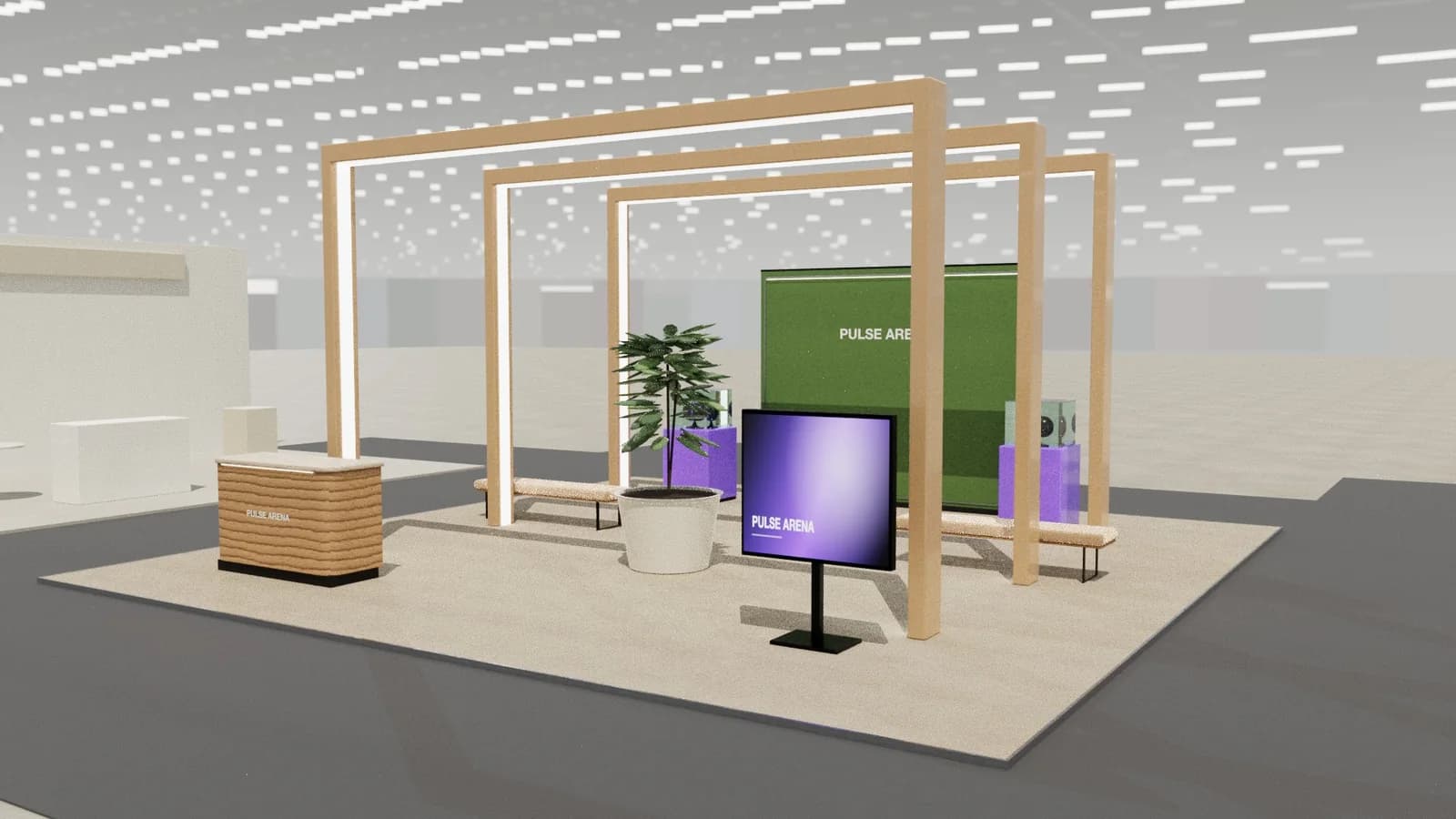
- One colour, used boldly on floor, counter and wall, rather than a full brand palette.
- A plinth with one hero product, lit from above.
- Plants as soft dividers and warmth: hired, not bought.
- A screen showing silent product video instead of printed panels with text.
Upgrading a shell scheme cheaply
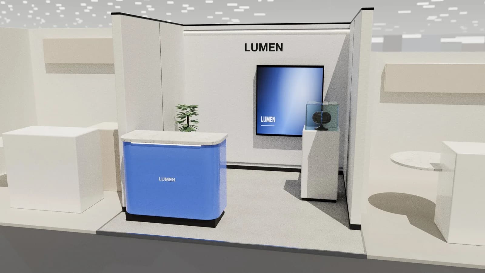
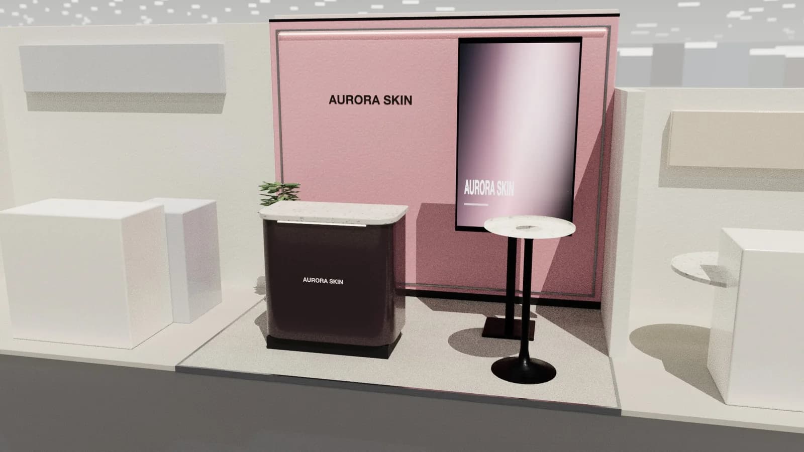
Shell scheme gives walls, carpet, lights and a fascia. Cover the panels with one printed fabric graphic (most shell systems accept clips or hook-and-loop), add two extra spotlights or a lightbox, bring one branded counter and remove the standard table and chairs. See 3 × 3 m booth design for layouts.
Design for reuse
The cheapest stand is the one you already own. A modular frame system with replaceable fabric graphics can be configured as a 3 × 3 m row stand at one show and a 6 × 3 m corner at another. Choose standard panel widths, avoid show-specific dates on graphics and store kit carefully. See modular vs custom stands.
Budget traps
- Late orders: venue services cost more after early deadlines.
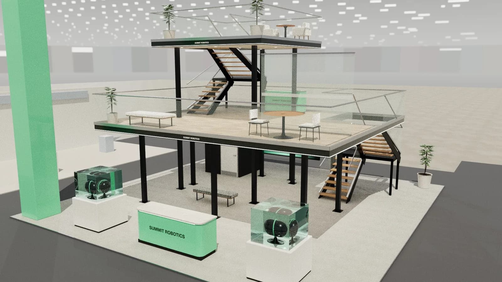
- Oversized space with too little to fill it.
- Cheap lighting that makes graphics look dull.
- Graphics reprinted for every show because they carry dates or stand numbers.
- Paying a designer to draw a layout that a template already solves.
Frequently asked questions
01What is the cheapest way to exhibit?
A shell scheme or table-top space, one good printed graphic, hired furniture and well-trained staff. Location in the hall often matters more than stand size.
02Is a pop-up stand worth it?
For frequent small shows, yes: it is light, quick and reusable. For larger spaces, a modular frame system scales better. See [portable displays](/guides/portable-trade-show-displays).
03How do I make a small budget stand look premium?
Restraint: one strong image, one colour, good lighting, no clutter and staff who keep the stand tidy.
04Should I spend on a screen?
If you have good video content, a hired screen is often better value than printed panels, and content can change per show.
Put it into practice
Design your trade show booth in 3D before you brief the builder
Design a trade show booth in 3D at your exact booth size, from a 10x10 inline to a 20x20 island, with renders and drawings for your builder.
Guidance here reflects common practice. Venues, organisers and countries set their own rules: always check the exhibitor manual and work with a qualified stand builder and engineer for structures.